
A.IdleHands
A Generative AI to Help Users Develop Meaningful Crochet Habits
A.IdleHands is a site that will help people learn the art of crochet, as well as further their skill with bundles of more advanced crochet patterns. In an attempt to help people learn a new skill, our team will use generative AI, Onyx, to guide users through learning about the art of crochet with confidence and clarity.
Summary
Problem
Yarn hobbies such as crochet have been around for generations. However, in a modern world, it can be difficult to translate this age-old hobby into the digital space.
Solution
With A.Idlehands, users can learn a new hobby, maintain their current skill set, and find projects that can introduce them to patterns they have never seen before. Helpful to any skill level, this product uses generative AI to teach users how to crochet and offers feedback on the progress that they make with their patterns.
Disclaimer:
A.IdleHands is NOT created to steal the intellectual property of fiber artists, it is simply meant as a tool to assist users and help them develop their skills. The bundles for sale are made by human fiber artists whom A.IdleHands has collaborated with.
Tools
Figjam
Figma
Trello
Adobe CC Suite
Google Suite
My Role
UX Design Lead - Chat
UX Mobile Design Lead - Chat
UX Research
Team
1 Project Manager
5 UX Designers
Timeline
4 weeks
Design Process
Research
Competitor Analysis
With such a unique concept, we had to begin with the tools and resources that are already available to those attempting to learn how to crochet.
Direct Competitors

EasyCrochet.com
This site is completely free to access. The site offers a four-week beginner class with an extensive curriculum, a large pattern library, and weekly newsletters for those who sign up for the email list.
Weakness: The site is geared towards beginners more than experienced crocheters, the beginner class is only available through articles rather than videos
SkillShare
Skillshare is a widely known brand and has a good reputation for having quality videos and instructional materials.
Weakness: Skillshare is available to those who pay a yearly fee ($168). You cannot buy courses individually so you have to pay the fee only if you are going to use a small portion of the classes. There is no way to ask questions or receive help when learning a new skill.

Indirect Competitors

Youtube
YouTube is widely known and is free to use. It is user-friendly and connects users to various content creators in all fields.
Weakness: YouTube videos are often interrupted by advertisements which can be frustrating for the user. YouTube does not offer a personal connection to the course instructor and there is no way to ask questions when learning the materials.
Etsy
ETSY is very well known in crafting circles and is often a first choice for people. ETSY offers products from a variety of sellers and has a good review system so you can see lots of information about materials before you purchase them.
Weakness: ETSY has lots of patterns but not necessarily a lot of information on how to learn the skill. The materials on this site are more for people who already know what they are doing rather than beginners.

All of these competitors had one thing in common: they were all missing a way to get a direct one-on-one guide in real-time.
Data Collection
We received 26 survey responses and conducted 9 interviews to better understand how users initially learned to crochet and how they continue with the craft. This input was referred to throughout the design process.
User Definition
Affinity Diagram
With all the data from the user interviews collected, we created an affinity diagram to better organize our notes and identify patterns among users.
![[A.Idlehands] FigJam (1).png](https://static.wixstatic.com/media/d510d0_46ab6335095b4be4804c02c8ed990cb7~mv2.png/v1/crop/x_396,y_132,w_27241,h_16662/fill/w_980,h_599,al_c,q_90,usm_0.66_1.00_0.01,enc_avif,quality_auto/%5BA_Idlehands%5D%20FigJam%20(1).png)
From here, we were able to identify some of the pain points that users were facing. Some users would get frustrated if there wasn't a visual pattern, and others would look for help in online forums like Reddit or Ravelry. None of these solutions offered real-time troubleshooting and were typically reactive. The roadblocks helped us create our user persona.
User Persona
Thanks to our insights, Jennie was created, an interior designer who loves to create unique spaces for her and her clients. She wants to learn to crochet to add a personal flair to her apartment.
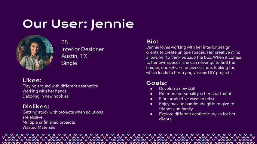
To differentiate our app from others, we created an AI named Onyx. They are used to help the user learn to crochet and keep up with patterns the users may be working on. We thought it would be helpful to create a persona for it to better understand the best way to tailor the AI to the users' needs.
.png)
Customer Journey
Here’s an experience we could see Jennie having before A.IdleHands.
She wants to find a unique piece for her apartment but is tired of the retail items she sees entering the market weekly. She decides to learn to crochet to create interesting home decor, while also gaining a hobby she can use to destress. Jennie, however, doesn't know the first thing about crocheting and doesn't know anyone personally who does. So she spends hours scrolling through YouTube videos and Google and she somewhat has the hang of it, but can't figure out why her swatches don't look like how they do on the video. Sadly, Jennie gives up due to frustration, as she's not able to get any real-time advice on what she's doing wrong.

Feature Prioritization
Empathy Map
We wanted to better organize how users thought while crocheting, thus created an empathy map.
Crochet projects can be a conversation piece if you are doing them in an airport or other waiting place
![[A.Idlehands] FigJam (4).png](https://static.wixstatic.com/media/d510d0_648e11b8c62b4fb6a98d7fc1a13a4661~mv2.png/v1/fill/w_609,h_647,al_c,q_90,usm_0.66_1.00_0.01,enc_avif,quality_auto/%5BA_Idlehands%5D%20FigJam%20(4).png)
“I love how relaxing it is”
Makes gifts for others
Frustrated with trying to figure out errors on their own.
Creative ideas
Seeing an expensive item made out of yarn and thinking “I can make that myself!”
Crocheted, handmade gifts are enormously meaningful to my loved ones
Not having progress photos to reference
Physiological benefits -- steady pulse, breathing, blood pressure reducer
Tangible item reward
Feature Prioritization
After some brainstorming, we decided what features to focus on for A.IdleHands. Many of the ideas were good, but to avoid scope creep and stay within the timeframe of the project, we decided to highlight the features that were both highly feasable and catered best to the user.
![[A.Idlehands] FigJam (7).png](https://static.wixstatic.com/media/d510d0_1405ffd666a349cca3eaa2ffb0705fd0~mv2.png/v1/fill/w_802,h_701,al_c,q_90,usm_0.66_1.00_0.01,enc_avif,quality_auto/%5BA_Idlehands%5D%20FigJam%20(7).png)
Lo-Fi & Mid-Fi Prototypes
Card Sorting
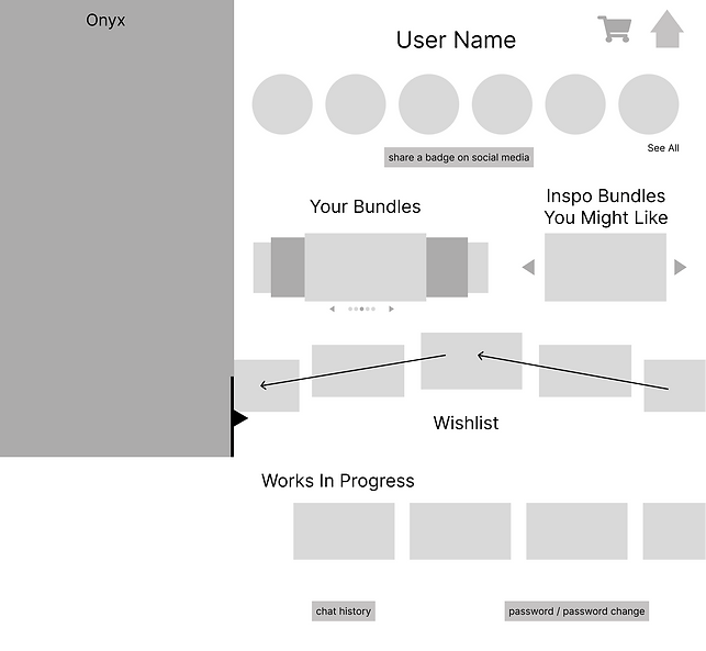
To best organize the site, we performed some card sorting. Here we decided what pages would exist and how the features we wanted to implement would be incorporated. Though we had few pages, this helped add functionality to the site while still not taking away from the main AI interaction.
![[A.Idlehands] FigJam (9).png](https://static.wixstatic.com/media/d510d0_854336a797dc42fc9cc9c365dffba913~mv2.png/v1/crop/x_257,y_289,w_4308,h_4865/fill/w_622,h_702,al_c,q_90,usm_0.66_1.00_0.01,enc_avif,quality_auto/%5BA_Idlehands%5D%20FigJam%20(9).png)
The general layout included:
-
Home
-
Chat
-
Profile
-
Badges / Achievements
-
Works in Progress (WIPs)
-
Purchases
-
-
Shop
-
Buy Pattern Bundles
-
Cart / Checkout
-
Lo-Fi Prototypes
We made a conscious decision to approach the design process a bit differently. Instead of starting with static layouts and then adding movement at the final stages, we wanted to think about how the pages would move from the beginning, starting with arrows and notes on the wireframes.
Desktop
microphone button blinking here to show it’s listening

not a circle;
it pulls lines in 2 directions to show you more;
you can pull either line in either direction
and the other line will go opposite;
slightly bigger when in center
for making chat full screen
1/3 of screen; locked in so other side is more responsive

possibly soft rotation when not being touched
fade to next option;
sets of 3 so all 3 act as one
continuous vertical scroll
locked in;
doesn’t scroll
overlapping carousel
default organized by most recent; maybe option to mark top 6 (hello again myspace lol)
fade to next option
possibly soft rotation when not being touched
simple horizontal scroll;
pause project option with a pop up notifying you that you can always ask onyx to resume
would remove from this list though
Mobile

not a circle;
it pulls lines in 2 directions to show you more;
you can pull either line in either direction
and the other line will go opposite;
slightly bigger when in center
slides in/out from left

microphone button blinking here to show it’s listening
pull up to bring in keyboard

default organized by most recent;
maybe option to mark top 6 (hello again myspace lol)
pull down bar to see more if over 6
overlapping carousel
possibly soft rotation when not being touched
fade to next option
simple horizontal scroll;
pause project option with a pop up notifying you that you can always ask onyx to resume
would remove from this list though

little heart for adding to wishlist on any bundle images;
same with small cart to add to cart
calling it “your” gives a feeling of ownership already and motivates people;
also use “earn” to promote feelings of accomplishment
Mid-Fi Prototypes
Furthering our unconventional methods, we added some details to our prototype before we began testing. We implemented our animations to get feedback from users.
.png)
.png)

Mid-Fi Iterations
We created a testing plan and used these to gauge how the user would interact with the site. We wanted to understand how the user thought, what was intuitive and what was difficult to understand. Here are some of the feedback received.
"I liked Onyx, I wished there was a way to keep the chat smaller instead of taking up the screen"
"Needs more labels (badges, wishlist, bundles on homepage)"
"I wasn't sure which icon would lead me to the Profile page"
“'Bundle up with bundles' wasn’t clear that it went to your wishlist"
“I like the prompts in the chat"
Style Guide
Now that we had our feedback, it was time to begin branding. After bouncing around ideas, we settled on a neon-painted desert theme that uses bright colors that make the site feel modern. The colors and imagery were used to evoke the feeling of a cold, dreary day and a soft glow, inspiring the user to stay inside and craft.

The typography used created a creative and crafty feeling and added that extra bit of whimsy.


The iconography is simple and straightforward, but using the color pallet as highlights and hover states brought them together within the design.

After testing our hi-fi, we implemented the feedback given. As a result, we have the final prototypes below:
Final Prototypes

Homepage - Desktop

Details Page - Desktop

Chat - Desktop

Homepage - Mobile

Profile - Mobile

Chat - Mobile

Details - Mobile

Conclusion
Challenges Faced
-
Developing our AI to work in conjunction with the artisan, and that artisans are given proper compensation and acknowledgments.
-
Pivoting from Onyx being a pattern generator to a crochet coach.
-
Working within the scope of our project, making sure it was properly researched and executed.
Lessons Learned
-
Importance of developing a brand voice that matches the brand aesthetic.
-
How to balance the scope of AI within the boundaries of the platform.
Next Stiches
-
Social Media will be a big part of A.IdleHands and having the Profile linked directly to IG, TikTok, Facebook, and X (Twitter) for sharing stories with progress, badges and posts to engage users, market growth and presence with our target demographic
-
Incorporating other craft practices within the greater yarn art world
-
Come up with more yarn puns!