
La Francesita Bakery
A lovely French Bakery located in
The Woodlands, TX
La Francesita is a French Bakery that wants to increase their engagement through their website. To redesign this website, we would be updating a lot of the bakery’s information to ensure accuracy, and also making it more accessible to the online crowd, who are frustrated by the discrepancies between menu and the store itself.
Summary
Problem
As of right now, their website is not an accurate reflection of the services the bakery can provide (such as Delivery and Curbside), and the menu items displayed on the website are not accurate to what is currently in stock.
Solution
To make the bakery more accessible for the end user - the customer - the online site needs to better reflect the business, leading to a more streamlined process for the business and the customers.
Tools
Miro
Figma
Trello
Adobe CC Suite
Clip Studio Paint
Google Drive & Forms
My Role
UX Mobile Design Lead
UX Research
Team
1 Project Manager
5 UX Designers
Timeline
3 weeks
Design Process
User Research
Our Stakeholder
To best understand the direction the project should go, we first interviewed our stakeholder, Yazmina, who owns La Francesita.
Yaz is a passionate business owner who wants to offer a taste of Europe to the Woodlands natives. She used to own a restaurant overseas and wants to bring that same experience to the US. As a team, we felt the frustration of going to the bakery and experienced mixed feelings that motivated us to work on this project.

One of the biggest issues Yaz faced was advertising her star item, palmiers, a crunchy cookie, which resembles an elephant ear or palm hands. Many customers visit just for these special treats, but La Francesita only has a limited stock of them every day. People arrived to get one with the sad surprise that they didn’t have them ready yet, or they had run out. This causes the business to lose customers quickly if they can't get the timing right.
Competitor Analysis
Now that we've looked into our business, we then looked outwards to what similar businesses were doing. We looked at direct and indirect competitors, and examined factors that could affect La Francesita.

Heuristic Evaluation
Before we began our redesign, we first evaluated the current state of the website.

01
02
03
04
05
06
07
08
09
10
11
-
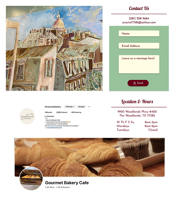
Business Name - Used so you're aware of what business you're looking at. Currently, it isn't big enough. The hierarchy doesn't make sense.
-
Primary Navigation - Used to view the full menu. With the size that it is, it doesn't feel like a call to action.
-
Social Interactions - Used to connect with the customers and their community. Considering the Instagram link is in two places, they really want people to follow them, so we should make the links/icons more prominent.
-
Carousel - Used to give a first impression of the bakery & alerts, updates for customers of La Francesita. The carousel is bigger than the logo itself, leaving it out of the hierarchy.
-
About Us - Used to describe the bakery and its values, is beneath the updates and quite small. Should be its own page or up at the top with the hero image.
-
Hero Image - An advertisement image for their coffee. Comes a bit too late on the page and is a bit jarring.
-
Newsletter - Box to collect users' information through email and sign up section to receive newsletter from the bakery.
-
Image Tile - A group of images of the bakery's food, along with an advertisement to follow on Instagram. Images may be better either on the menu or in the carousel itself.
-
Instagram Advertisement - Is inserted into the image tile, and should be more of the focus if it's an Instagram ad.
-
Chunking - Used to make it easier for customers to find important information. Usually, the hours would be featured higher up on the page, and the contact information would be included in the footer.
-
Footer - The height is small and the letters are also too small and repeating information is already located in the header and on top of the footer.
Data Collection
Now it was time to get into the research. We received 26 survey responses and conducted 9 interviews to understand the criteria that users put a restaurant website through. This input was referred to throughout the design process. We also interviewed our stakeholder to understand her needs and the message she wanted to convey to her customers. And to further understand the customers, we performed 6 hours of observation on how the customers interact while they're in the restaurant, how they pay, and how long do they stay there.
The Sweet Spot
Analyzing the wants and needs of our stakeholder and our users, we were able to determine what we needed to fulfill: Being able to view the menu online, A place to connect with their community, and quick and efficient service. We labeled this intersection of goals The Sweet Spot.
.png)
User Definition
Affinity Diagram
With all the data from the user interviews collected, we created an affinity diagram to better organize our notes and identify patterns among users.
.jpg)
From here, we were able to identify some of the pain points that users were facing. There is a lot of confusion around the branding due to the multiple menus, and they feel that service is very slow (there is not enough staff) and the staff is inattentive as a result. Customers struggle when there is too long of a line to order.

We also considered our stakeholder and organized data collected from her. For Yaz, there was mismatch information on her website, such as offering delivery when they do not. She also has difficulty finding staff, which causes an issue for the customers as they see the direct effects in the long wait times. She wanted her site to be more visually stimulating, and some integration of social media, something else she struggles with maintaining.
.jpg)
User Persona
We put everything we learned from our interviews into perspective and constructed our user persona, Rick. He’s a family man who enjoys new experiences; especially in his new home. He loves the immersion of themed restaurants but hates it when they’re too crowded and have long lines.
.png)
Customer Journey
Here’s an experience we could see Rick having before our redesign.
He hears about the delicious Palmiers and decides to learn more about them on the website. Unfortunately, he doesn’t learn much but decides to order one anyway. With the Palmiers out of stock again, Rick becomes frustrated after learning the only way to reserve one is over the phone.
.png)
Feature Prioritization
The restaurant has many loyal customers. Many enjoy the visit and experience with the staff and come back regularly. However, many of these customers didn’t even realize they had a website. New customers may find them online but aren’t sure of the environment they are going to enter. When these new customers do visit by chance, they enjoy their experience but wish they could have understood their online presence beforehand. Many customers, new and old, would enjoy ordering online.
Problem Statement: Rick is looking for a local place to get immersed in the community, and enjoys going out to eat. He finds a bakery online, but isn’t sure of the kind of restaurant it is. He’s hesitant to visit in person due to the lack of information about the restaurant.
How Might We...
-
Set the stage for Rick’s in-person experience?
-
Increase the customer’s confidence in the reliability of information found on the website?
-
Help customers figure out the best times to get the specific items they’re craving?
-
Entice a customer to visit the bakery simply by looking at the website?
-
Streamline the customer’s experience with interacting with the bakery?
-
Assist the customer in utilizing the website to see current menu options, specials, prices, or deals?
Feature Prioritization
We created a feature prioritization map to aid our prototypes and avoid scope creep in our design. Using this method we visualized and prioritized features that users would value and also were achievable for us and aligned with stakeholder needs and availability to provide the online service.

Lo-Fi & Mid-Fi Prototypes
Site Map
Now that we had the features we wanted to implement, we created a site map to decide where they would go. The original site had three pages, and we expanded that to five, as well as supplemental pages like the menu having multiple tabs for the multiple categories of food that La Francesita offers.
.jpg)
Lo-Fi Prototypes

We started with wireframe templates and used these to create our lo-fi prototypes. The home screen began with using the shape of an awning as the navigation bar, giving the vibe of a Parisian cafe.
Provided a section to display specialty items made by La Francesita and quickly link the user to the menu.
The newsletter section was created to match the original design.
We added the location, hours, and contact information to the footer to remind users where La Francesita can be found once they reach the end of the large home page.
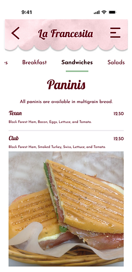
The original menu was just an infinite scroll of information. The text was large and quite overwhelming to users.
So we created a tab system that made it easier for the user to find something they may be interested in. This also makes it easy for users who have special diets to find an item that fits their lifestyle.

To create a responsive web design, we created mobile versions as well.


Mid-Fi Prototypes
After a round of usability testing, we iterated and implemented the changes that would better the user experience.

In this iteration, we addressed the issue of understaffing by literally putting out a hanger that the restaurant is hiring.

We also implemented this "Reserve a Palmier" section to address customer disappointment when La Francesita runs out of their star item. I will go into further detail later.

We changed the "menu" section to a gallery that displays images from the restaurant's Instagram and images taken by us of the restaurant. It made more sense to have relevant images of the restaurant and photos from La Francesita's Instagram than having the menu on the home page.
We also added small inserts that link to other pages of the site and social media.

We changed the specialty item section to be more concise.
Also added testimonials from previous customers. This was a suggestion by users, as reviews tend to add a sense of credibility to the restaurant.

We changed some design elements to the footer to make it more accessible to read.
The Palmier Problem
We knew based on research and observations that people were struggling to buy Palmiers (a star item) because they:
-
Didn't know when they were ready or sold out and sometimes arrived at the bakery to get the news.
-
They had to call and sometimes the staff couldn’t answer because they were busy.
-
The palmiers would sell out while customers were in line to order.
Solution: We came up with the idea of Palmier reservation online to alleviate the frustration of the customer and also assist staff to have more organization with how many Palmiers they were doing for the days to come reducing waste and gaining more profit.

The Iterative Process
.png)
Final Prototypes
Home Page - Desktop

About Us - Desktop

Menu - Desktop

Reserve a palmier - Desktop

Contact - Desktop
Home - Mobile

About - Mobile

Menu - Mobile
Reserve - Mobile

Reserve Confirmation - Mobile

Conclusion
Some of our early solutions, like more involved social media integration, online ordering through the website or apps like Doordash, and curbside pick-up didn’t quite fit the owners’ needs. We also assumed that she would want to be more involved with maintaining the website. We had to pivot from these early assumptions to create a product that suited both the owner and her customers.
Next Steps
-
Spanish translations for the website and menu
-
Reward points program for loyal customers
-
Display for busy/high traffic times in the restaurant
-
Google Maps pin for the address
-
Implementation of site changes with a developer
Additional Items
A/B Testing
We performed some A/B testing to decide the best font choice for the navigtion for mobile and desktop

Results
A - 26

B - 56
Responsive Web Design
Here's how the site looks across multiple screen sizes.

Front-End Development
I had the opportunity to rediscover my passion for front-end development by being able to fully code the home page in VSCode using HTML5 and CSS.
Though not used in this project, I also gained familiarity with Javascript, jQuery, and Bootstrap4/5.

